Soldo
Tasks
UI, UX, Redesign, Design system
Time
June 2017 – Jan 2018
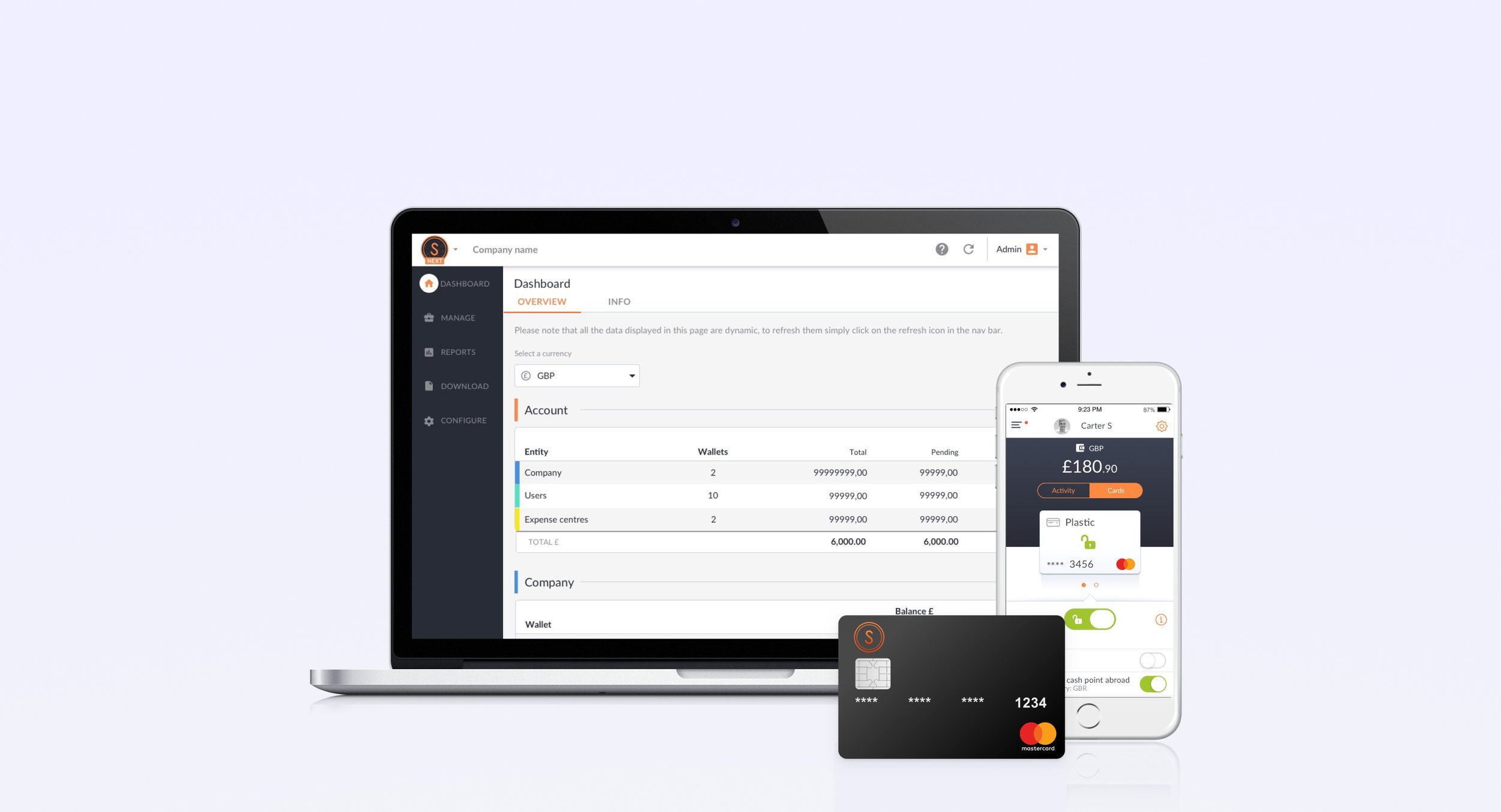
I developed concepts and solutions to create innovative products for managing personal and business finances. With the smartest financial and payments technology Soldo seamlessly attaches receipts, tags and categorises all spending made using a virtual or plastic Mastercard. It also integrates to most accounting software. This can be managed on an intuitive admin dashboard, that works seamlessly with mobile apps for employees and personal use.
From research we discovered that it slowed down the users' workflow and created friction when checking multiple transactions. With the old design the user would select a transaction from a list, the details would then be shown on a page that overlaid the list of transaction. We also wanted to create a way for users to report problems with a transaction in a scalable way. Currently customers phone customer services, which isn't efficient as the business is growing.
Transaction Details
Old design
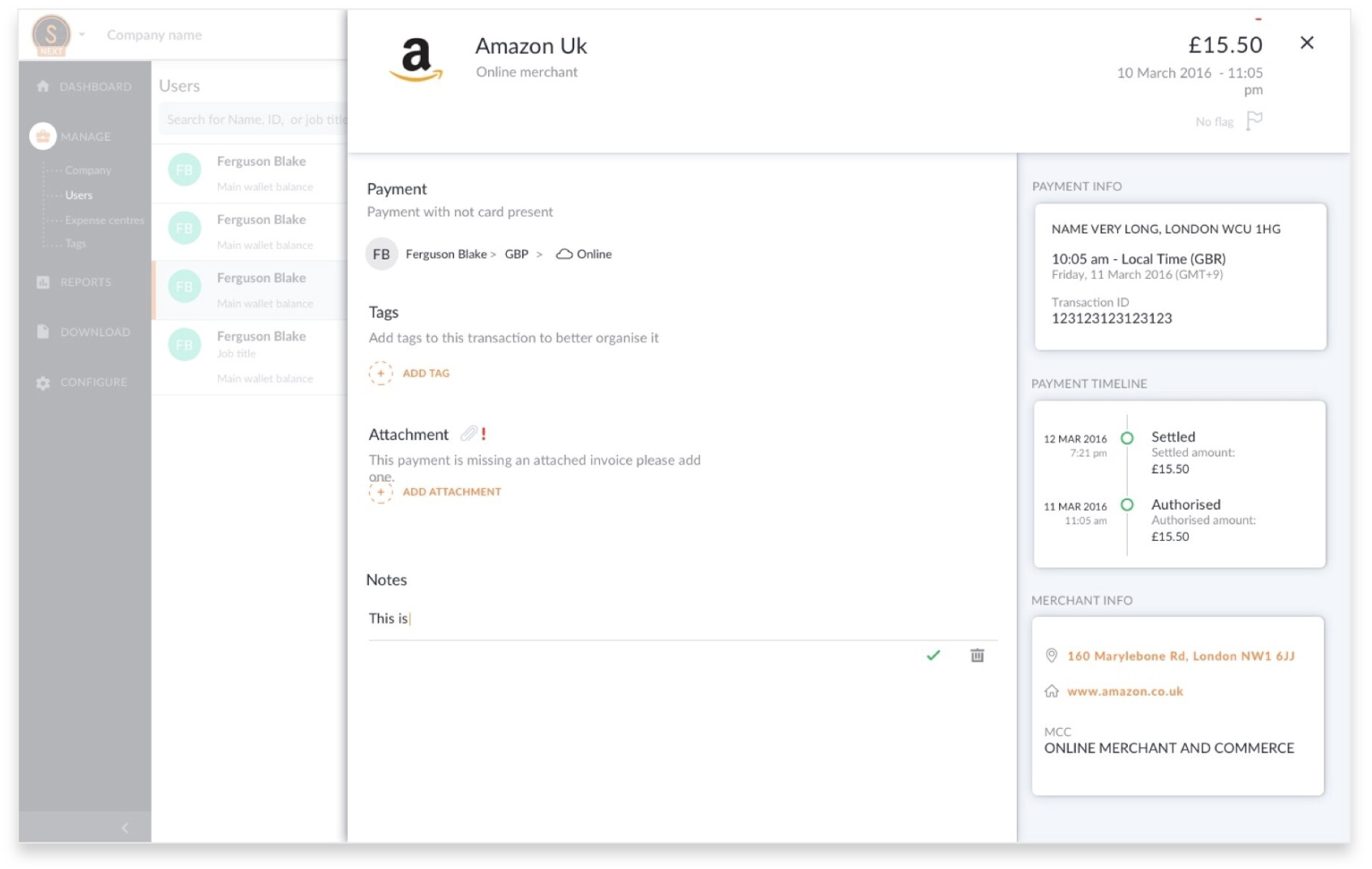
The old design created friction in user’s workflow due to the overlay design of the feature to view transaction details. Users were not able to quickly navigate between transaction due to the design and loading.
New design
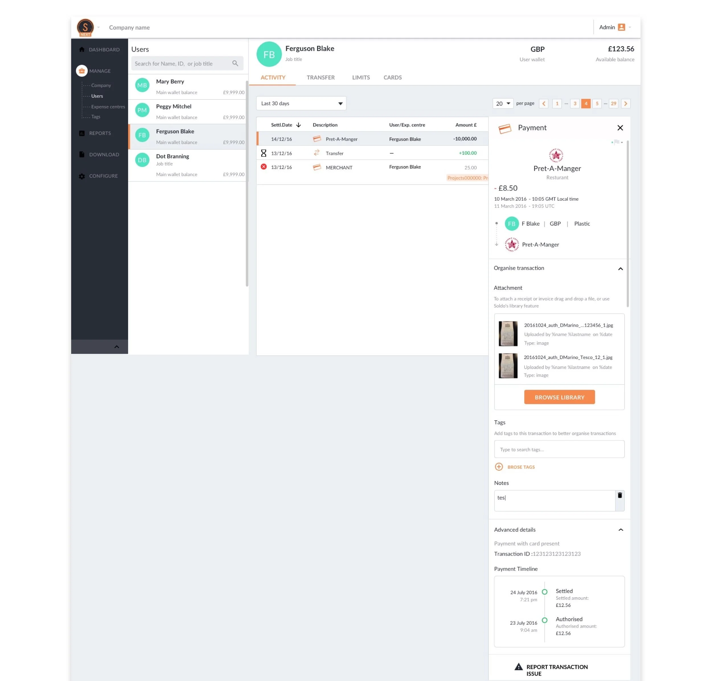
Goal
Improve user journey and experience when reviewing transactions.
Allow admin to move seamlessly between transactions
Help users to solve and report problems regarding transactions
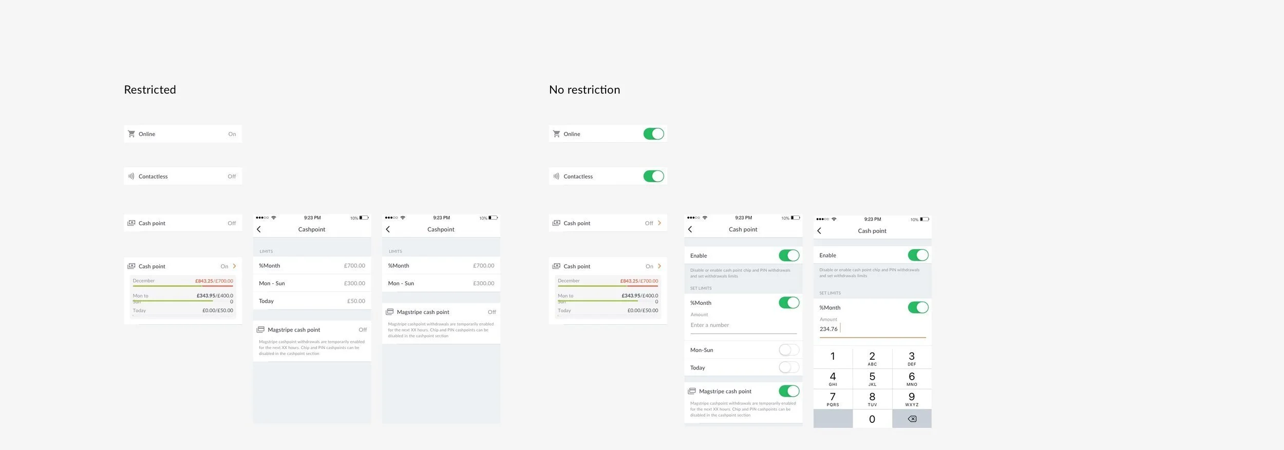
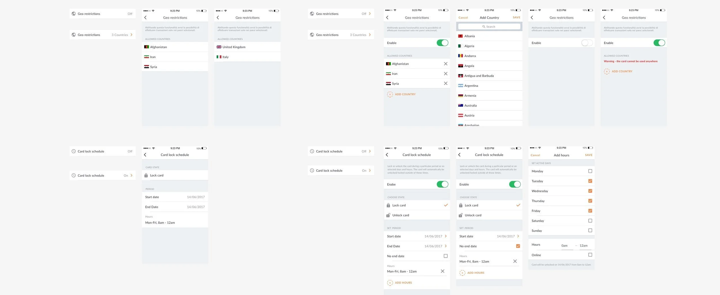
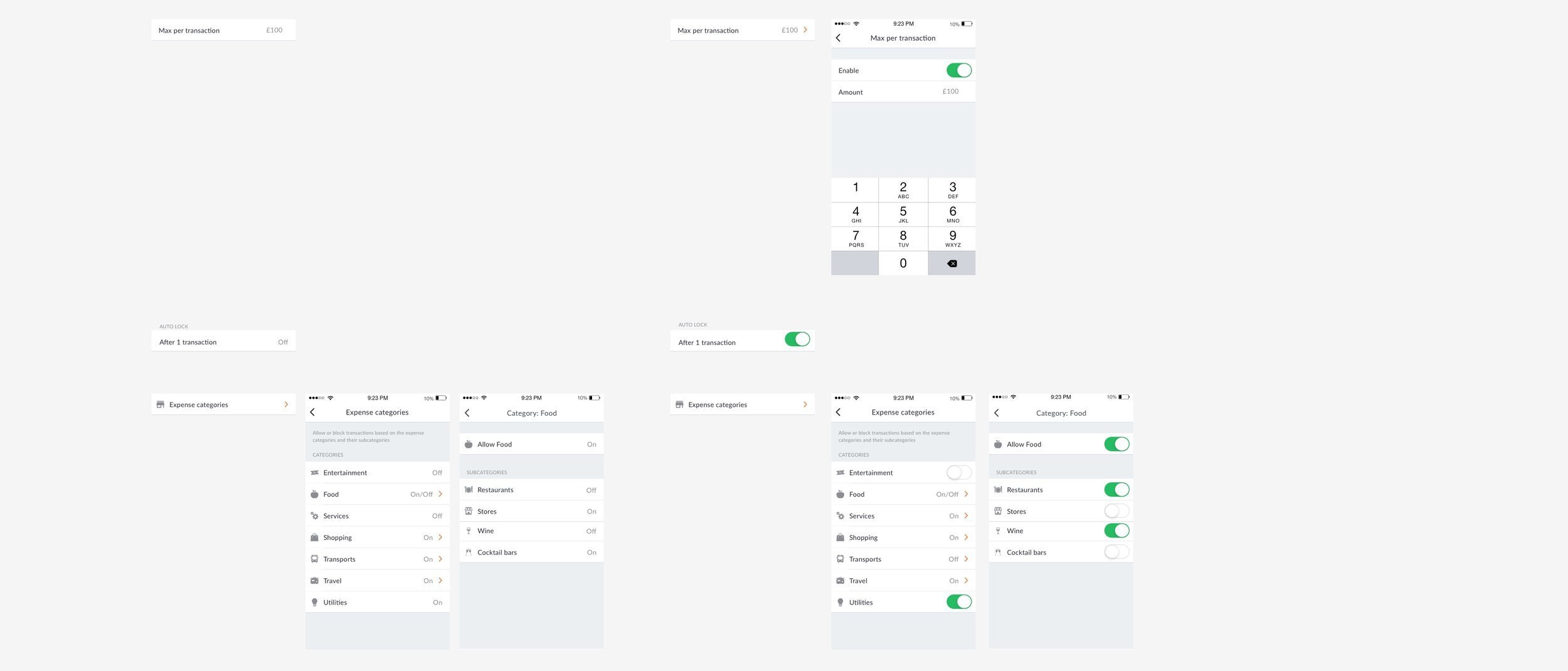
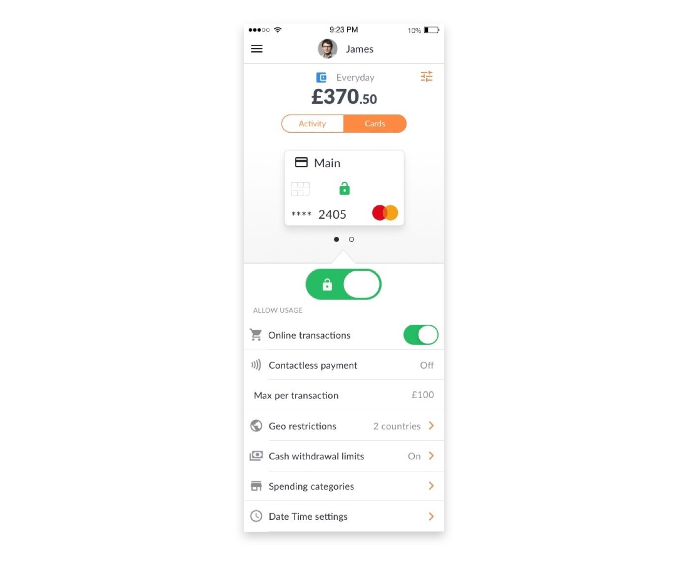
Card permissions
Permissions are used to control and restrict spending activities. The current structure was built for then Soldo family product, how ever they are not refined enough for business use. The employee app can edit these permissions, similarly to the parent app, but it can also be controlled from the admin dashboard. This creates a conflict, the admin Dashboard and the employee app need to work cohesively, allowing the admin dashboard to be able to set controls.
Old design
The app designs mirrored the dashboard with no clear way to communicate different permission levels that have been applied by the admin.
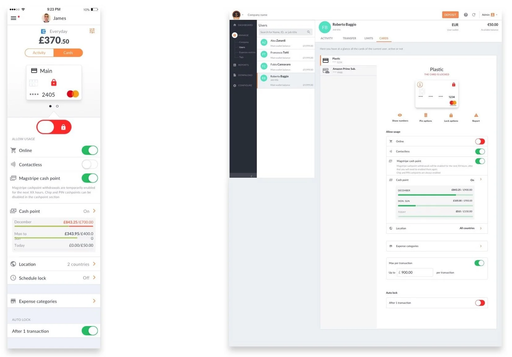
Goal
To establish permission rules and create a visual language that best conveys to the app user the restrictions applied and whether they have capabilities to change the restriction.
Design concepts
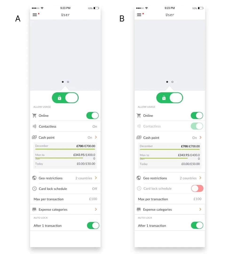
Concept A is a combination of toggle buttons and text. The text conveys that the permission cannot be changed as it doesn’t appear to be clickable.
Concept B uses mainly toggle buttons, the ones that cannot be changed are disabled.
User testing
We tested the Deisgns on 6 users, giving each users two scenarios. Our aim was to understand how users would make sense of the designs in relation to the spending scenarios they were given. By using the scenarios, we were able to see how this would be used in a real life context, the user is most likely to use this page when investigating the possible reasons a transaction didn't go through. This could be at the till in a shop, where they are holding up the queue. We will address the first point of information by using a banner, depending on the user's notification settings, it is possible that they may miss the notification. We need to make sure the feature works without the banner.
Design system
We explored looking at how to convey to the user the state of the restriction and whether they had the ability to change it. For the first design we used a combination of text and the toggle icon. Our hypothesis is that by using text the user would realise that it is not possible to change the state. In the second design we showed this by making the element slightly transparent.